Underhill Brand
UNDERHILL GEOMATICS LOGO
The Underhill Geomatics logo can be used when referring to Underhill Geomatics Ltd., the surveying engineering services arm of the firm.


UNDERHILL & UNDERHILL LOGO
The Underhill & Underhill logo can be used when referring to Underhill & Underhill, a partnership of professional land surveyors.


UNDERHILL COMBINED LOGO
In cases where both company names need to be utilized, a combined version of the logo can be used. This would be used in specific situations when both names are necessary for legal reasons.


UNDERHILL ICON
In rare cases where it is not possible to use the full Underhill brand, the logomark or ‘icon’ can be used.
COLOURS
Our company colours are professional and modern, expressing who we are.
Underhill Blue is defined as Pantone Process Blue C. This is the main colour utilized in our branding.
The following tertiary colours are used to complement the main blue brand colour.

PANTONE Process Blue C
RGB 0 133 202
HEX 0085CA
CMYK 100 15 0 6

PANTONE 158-15C
RGB 115 151 63
HEX 73973F
CMYK 41 0 85 32

PANTONE 45-5C
RGB 245 126 37
HEX F57E25
CMYK 0 62 97 0

PANTONE 104-7C
RGB 45 108 181
HEX 2D6CB5
CMYK 85 58 0 0

PANTONE 127-3C
RGB 145 211 206
HEX 91D3CE
CMYK 42 0 22 0
TYPOGRAPHY
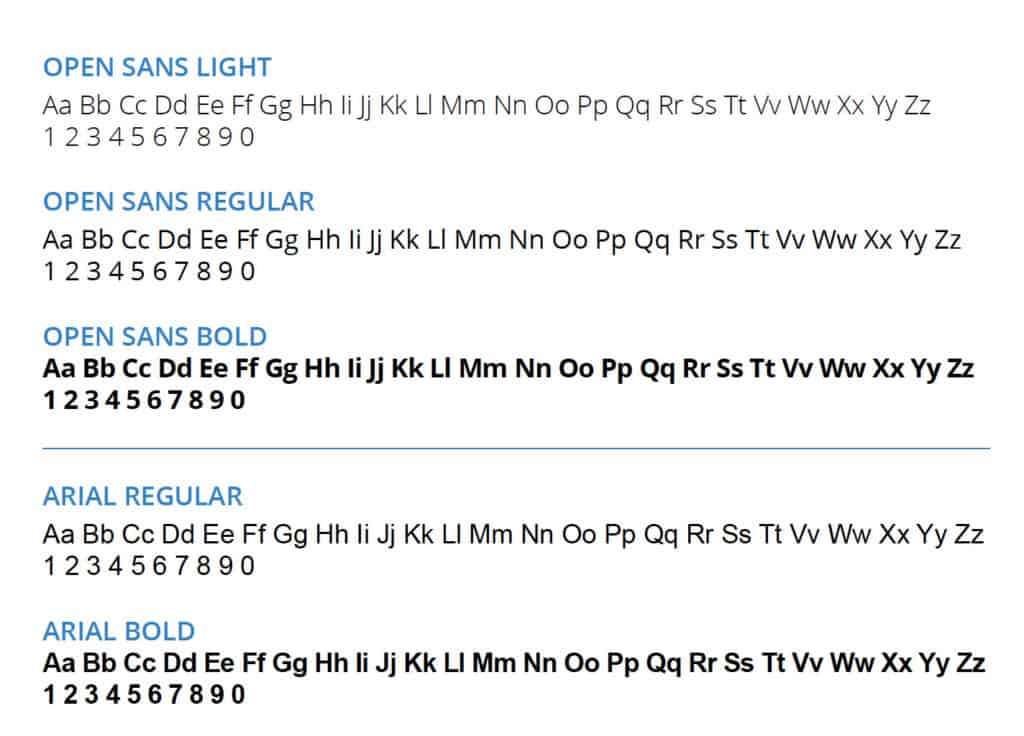
Our primary typeface is Open Sans. We use Light, Regular and Bold. Whenever possible Open Sans should be used.
When the use of Open Sans is not possible Arial is the alternative choice.

LOGO TREATMENT
The logo must be used as is and not be altered in any way. This means that you must not:
- Change the logo’s orientation or rotation.
- Disproportionately scale or resize the logo.
- Change the logo’s colors.
- Display the logo with colour combinations not previously specified.
- Display the logo in a configuration not previously specified.
- Add special effects to the logo.
- Add an outline to the logo or display the logo as an outline.
- Use the logo on top of busy photography.
- Display other elements within the logo’s designated clear space.
- Crop the logo in any way.

CLEAR SPACE
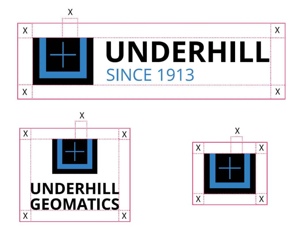
All forms of the Underhill logo must have a designated amount of clear space on all sides unoccupied by other elements. This is to ensure the logo’s visual clarity and effectiveness.
The clear space is defined as the space in the top right section of the icon or logomark’s crosshairs.


