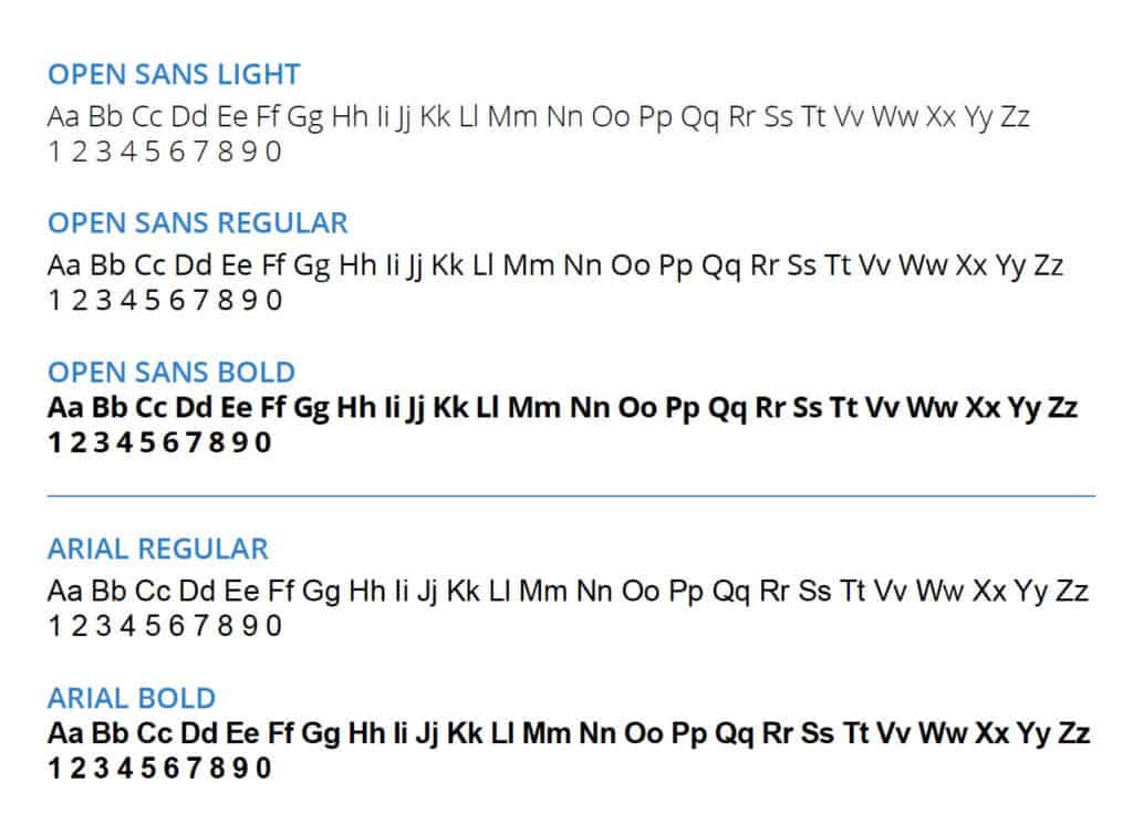
Our primary typeface is Open Sans. We use Light, Regular and Bold. Whenever possible Open Sans should be used.
When the use of Open Sans is not possible Arial is the alternative choice.
Logo Treatment
The logo must be used as is and not be altered in any way. This means that you must not:
Change the logo’s orientation or rotation.
Disproportionately scale or resize the logo.
Change the logo’s colors.
Display the logo with colour combinations not previously specified.
Display the logo in a configuration not previously specified.
Add special effects to the logo.
Add an outline to the logo or display the logo as an outline.
Use the logo on top of busy photography.
Display other elements within the logo’s designated clear space.
Crop the logo in any way.
Clear Space
All forms of the Underhill logo must have a designated amount of clear space on all sides unoccupied by other elements. This is to ensure the logo’s visual clarity and effectiveness.
The clear space is defined as the space in the top right section of the icon or logomark’s crosshairs.
Underhill Brand Guidelines
Download a full copy of our brand guidelines in PDF format.